Multiple Teams
This template allows to analyze the findings, the density and the trends of specific team and its projects within a configurable timeframe.
KPIs
Total Teams Data
The Total Teams Data card shows details related to the teams included in the report, such as the total number of members, total number of projects and total number of scans.
 |
Filtered by
In the Filtered by card you can see which filters were applied for generating the report:
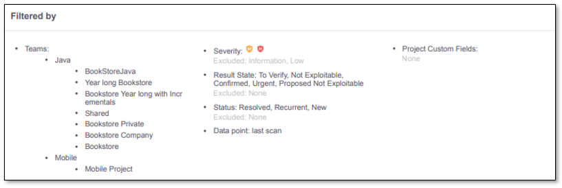 |
Included: Data included in the report. All data available in the report is filtered according to the specified included filters.
Excluded: Data filtered out from the report.
Specific filters can be applied when generating the multiple teams report to restrict and refine the data and the results to analyze.
The following filters can be defined when generating the report:
Projects: By default, all projects belonging to the team are included.
Exclude the project names that you do not want to include in the report.
Project Custom Fields: By default all project are included in the report.
The allowed values to be included are based on a key-value pair, where the key is the custom field name and the value is its correspondent value in the project definition.
Severity: By default, Low and Informative results are excluded.
Allowed values to be excluded from the report are: Critical, High, Medium, Low and Information.
Result State: By default, all Result States are included.
Allowed values to be excluded are: To Verify, Confirmed, Urgent, Proposed Not Exploitable, Not Exploitable.
Status: By default, only New and Recurrent are included.
Allowed values to be exclude are: New, Recurrent and Resolved.
What happens when Resolved Results are included?
Resolved Results section is displayed in the report.
All other KPI calculation (out of Resolved Results section) are not affected by the Resolved Results.
What happens when Resolved results are excluded?
Resolved Results section is not displayed in the report.
Timeframe: Defines the date range in the analysis and it is composed by a starting date and an ending date. The maximum allowed period to be defined is 1 year. In case the timeframe is not defined:
The Timeframe used is the teams lifetime.
If the teams lifetime extends over 1 year, the timeframe starts from the year prior to the last scan date.
Data Points: Allowed values are last or first. The default value is last.
last: means the last scan is considered.
first: means the first scan is considered.
Total Results Overview
The Total Results Overview provides trend analysis over time, based on the aggregated results for all the teams and their projects included in the report.
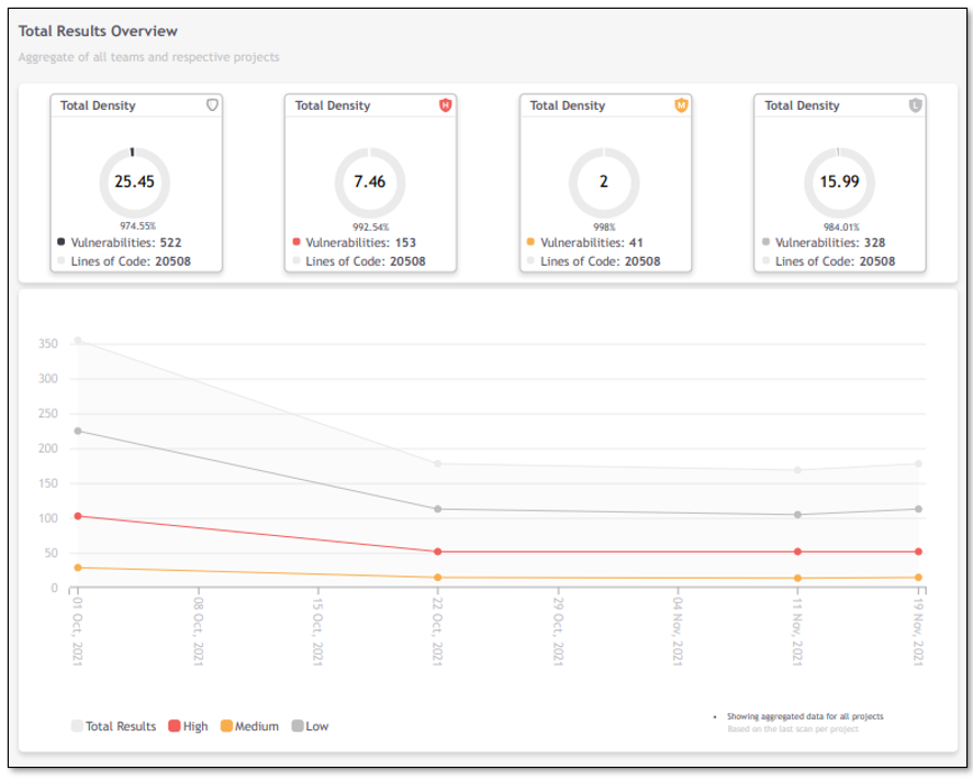 |
The values displayed in the Density cards are calculated based on the last full scan executed for each project within the timeframe under analysis.
The Preset Change indicators mark the dates when changes to the preset occurred to help you understand how they affect the total results and possible variations in the findings over time. The indicators are displayed only when all the projects share the same preset, otherwise it will not be displayed in the chart.
In the Total Results Overview chart, the dates on the timeline (x-axis) are based on the length of the timeframe and the report format (as described in Report Formats below). Each date value on the timeline indicates the end date of each data period.
Report Formats:
In PDF format, if the timeframe period is:
over 180 days, the data points are every 2 weeks.
over 30 days and under 180 days, the data points are per week.
under 30 days, the data points are per day.
In JSON format, the full scope of data is presented
Example: Monthly Timeframe
Timeframe: From 1st of January to 30th of January.
Data point: last scan.
Data points are displayed per week, where the first data point identified is the 7th of January and shows the results for the last scan executed between the 1st and the 7th.
The second data point is identified by 14th of January, the third by the 21st of January, the fourth by the 28th of January and the last would be identified by 5th of February (even if it extends the timeframe filter).
Example: One Year Timeframe
Timeframe: From 1st of January to 31st of December.
Data point: first scan.
Data points are displayed every 2 weeks, where the first data point identified is the 14th of January and shows the results for the first scan executed between the 1st and the 14th of January.
Latest Results Overview
The KPIs displayed in the Latest Results Overview are calculated based on the results of the last full scan executed for each project, during the specified timeframe.
By State
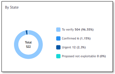
The pie chart shows the number of results grouped according to each state. The total of results and its percentage is displayed for each State.
The KPIs show the aggregated results of all the teams and their projects included in the report.
By Status
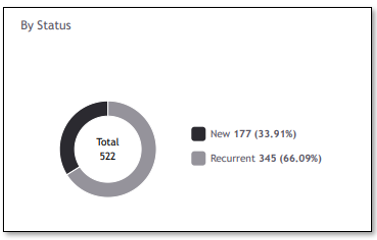
The pie chart shows the number of results grouped by Status (New vs Recurrent). For each status, the total of results and its percentage is displayed.
The KPIs show the aggregated results of all the teams and their projects included in the report.
By Severity
 |
This pie chart shows the scan results grouped by the Severity. For each severity, the total number of results, its percentage and the trend are displayed. The trend is calculated between the current timeframe and the previous one, meaning that if you are analyzing the last 3 months, the trend is the difference between the results within the timeframe currently under analysis and the results from 3 months ago. The main goal of the trend calculation is to help you understand if the results are decreasing or increasing with time.
The density and density trends are also available in this card.
The KPIs show the aggregated results of all the teams and their projects included in the report.
By Team
 |
The table shows the total number of results by team and for each there is a breakdown by severity. The number of projects each team has is also displayed. The project trend indicator shows the difference for the total team' projects, between the current timeframe and the previous one.
The blue capsule shows how many new vulnerabilities appeared and how many were resolved between the current timeframe and the previous one. The Scan Trend is the difference between the New Vulnerabilities and the Resolved ones (New – Resolved).
Top 5 Risky Projects
 |
From all the projects included in the report, the Top 5 Risky Projects are calculated based on the total number of results that each project has in the last full scan executed within the timeframe in analysis. The project having the highest number of results is considered as the most risky one. The team name is also displayed, so you can understand which team owns the project.
Top 5 Most Common Vulnerabilities
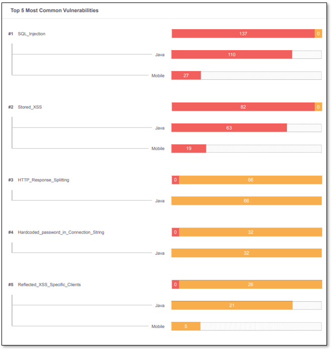 |
Using all the included teams and their projects as a reference, this card displays the Top 5 Vulnerabilities having the most results and the teams with those top vulnerabilities.
Resolved Results Overview
This section only appears if Resolved Results is included in the report (defined in the Filters).
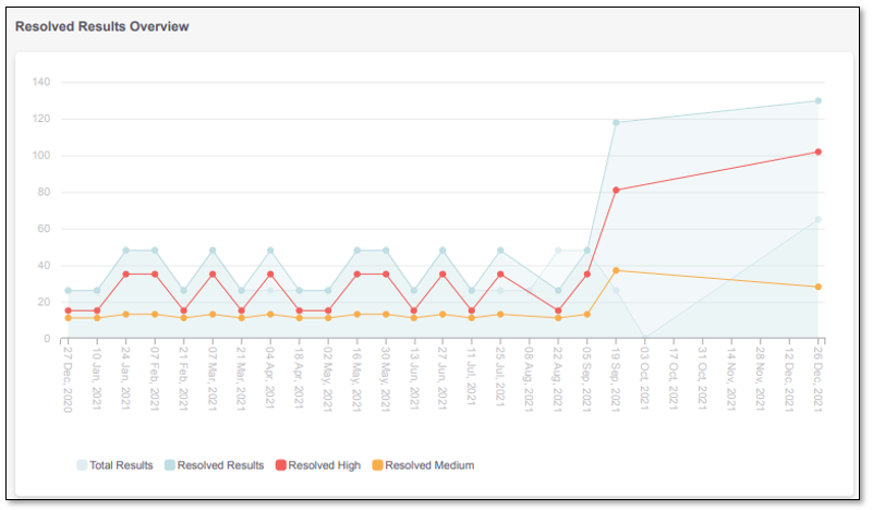 |
The Resolved Results Overview chart provides trend analysis over time, based on the aggregated resolved results for all the teams and their projects included in the report.
The Total Results line shows the number of results currently present in the projects, so you can compare the ratio between resolved and open results.
The Preset Change indicators mark the dates when changes to the preset occurred to help you understand how they affect the total results and possible variations in the results over time. The indicators are displayed only when all the projects share the same preset, otherwise it will not be displayed in the chart.
Top 5 Teams with Resolved Vulnerabilities
 |
The Top 5 Teams with Resolved Vulnerabilities shows the teams which had the most results resolved within the timeframe under analysis. The display also shows for each team, the total number of results resolved, arranged according to severity.
Teams
This section displays specific information for each team that is included in the generated report.
Data Information
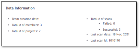 |
The Data Information card shows details related to the team, such as the total number of members, total number of projects and total number of scans and last scan date.
Total Results Overview
The Total Results Overview provides trend analysis over time, based on the aggregated results for all the team' projects included in the report.
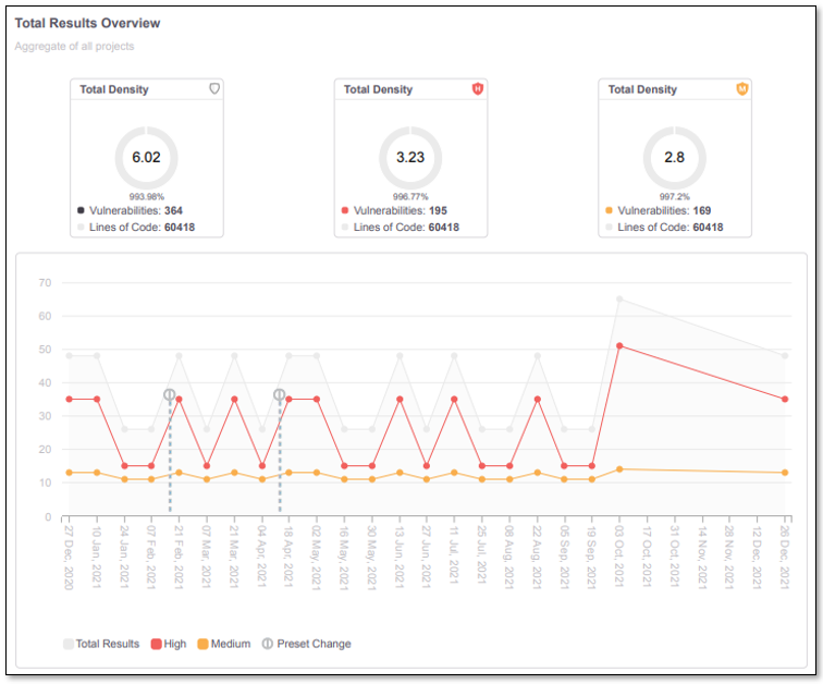 |
The values displayed in the Density cards are calculated based on the last full scan executed for each project within the timeframe under analysis.
Latest Results Overview
The KPIs displayed in the Latest Results Overview are calculated based on the results of the last full scan executed for each project, during the specified timeframe.
By State
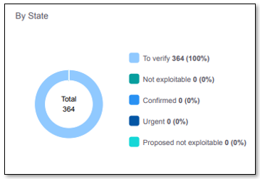
The pie chart shows the number of results grouped according to each state. The total of results and its percentage is displayed for each State.
The KPIs show the aggregated results of all the team' projects included in the report.
By Status
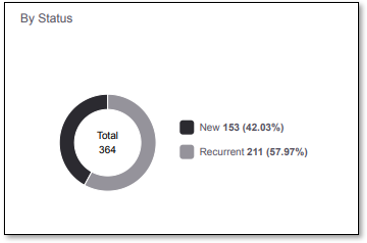
The pie chart shows the number of results grouped by Status (New vs Recurrent). For each status, the total of results and its percentage is displayed.
The KPIs show the aggregated results of all the team' projects included in the report.
By Project
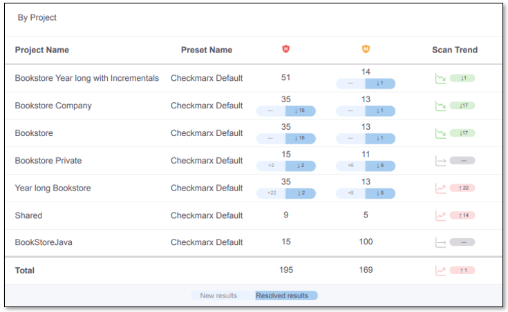 |
The table shows the total number of results by project and for each there is a breakdown by severity. The preset name defined in each project is also displayed.
The blue capsule shows how many new vulnerabilities appeared and how many were resolved between the current timeframe and the previous one. The Scan Trend is the difference between the New Vulnerabilities and the Resolved ones (New – Resolved).
Top 5 Risky Projects
 |
From all the team' projects included in the report, the Top 5 Risky Projects are calculated based on the total number of results that each project has in the last full scan executed within the timeframe in analysis. The project having the highest number of results is considered as the most risky one.
Top 5 Most Common Vulnerabilities
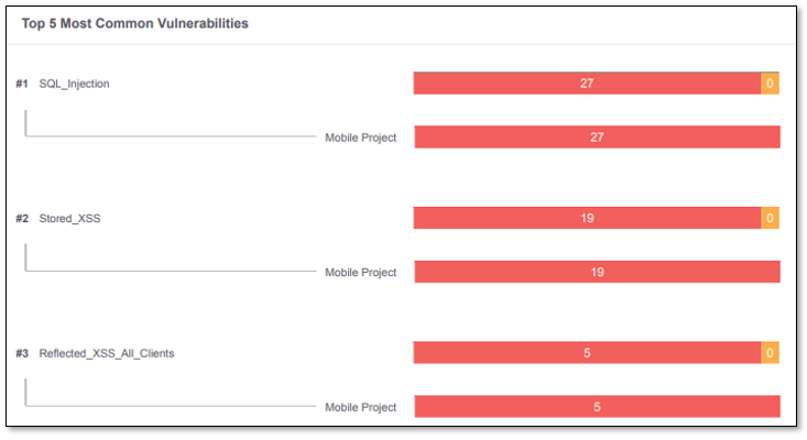 |
Using all the included team' projects as a reference, this card displays the Top 5 Vulnerabilities having the most results and the projects with those top vulnerabilities.
Total Executed Scans
Top 5 Scanned Projects
 |
Using all the included team' projects as a reference, the pie chart displays the Top 5 Projects having the most full scans executed within the timeframe in analysis. For each project, the total number of scans is displayed.
State Transition Metrics
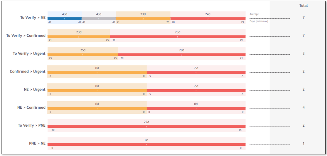 |
For each transition detected from the project set, within the timeframe in analysis, you can see how many days the transition takes on average, and how many results have changed.
Resolved Results Overview
This section only appears if Resolved Results is included in the report (defined in the Filters).
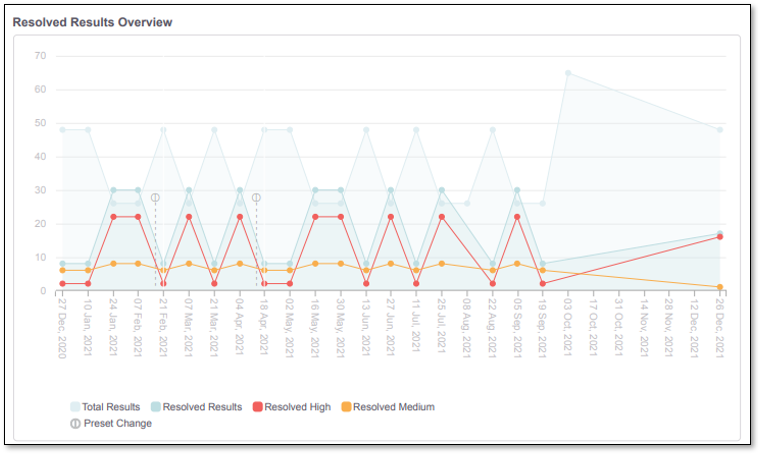 |
The Resolved Results Overview chart provides trend analysis over time, based on the aggregated resolved results for all the projects included in the report.
The Total Results line shows the number of results currently present in the projects, so you can compare the ratio between resolved and open results.
Top 5 Projects with Resolved Vulnerabilities
 |
The Top 5 Projects with Resolved Vulnerabilities shows the projects which had the most results resolved within the timeframe under analysis. The display also shows for each project, the total number of results resolved, arranged according to severity.
In the example above only the WebGoat project has resolved vulnerabilities within the timeframe in analysis.