Vulnerability KPIs
The following KPIs have been added. All calculations herein include both full and incremental scans.
By default, the only filter applied is the time range, which displays only data for the scans executed in the last month. For more details regarding filters, please see Filtering KPIs.
Mean Time to Resolution by Severity
The Mean Time to Resolution (MTTR) KPI provides valuable information on the number of vulnerabilities resolved for each severity level and the average time it took to resolve them (measured in days).
The MTTR helps assess the efficiency and effectiveness of the vulnerability resolution process and focuses only on vulnerabilities that have been resolved.
 |
In the above example, 351 High vulnerabilities were resolved between July 6, 2022, and July 6, 2023. The average time to resolve the 351 results is 1 day.
For more details about the KPI calculation, please see MTTR Calculation.
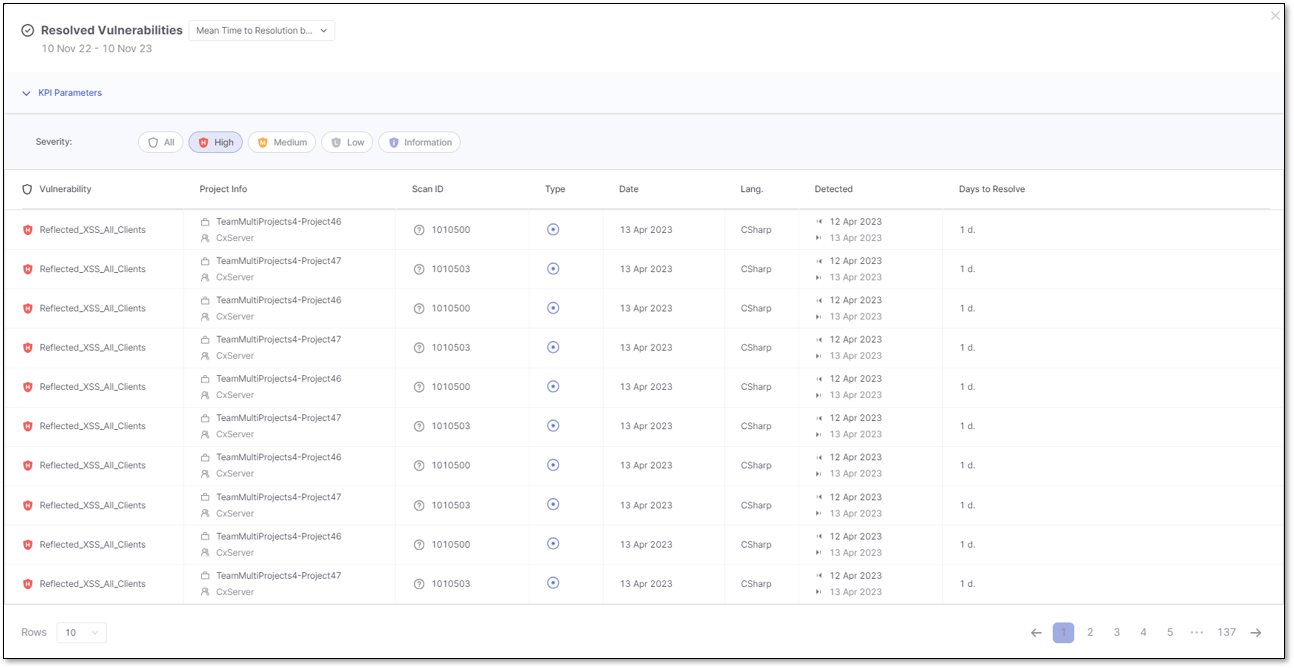
A Show on Table option appears when hovering over a specific severity card. Clicking on it opens a new modal window that lists all the resolved vulnerabilities for the selected severity. Details such as the first and last detection date, aging, language, and days to resolve are displayed for each vulnerability.
Vulnerabilities by Severity
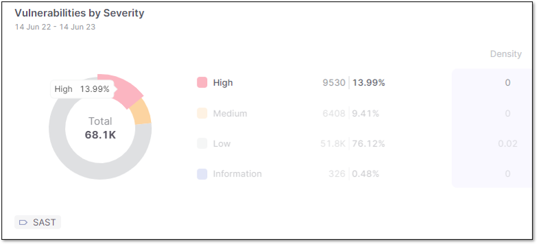
The pie chart below displays the total results organized by severity levels, their percentage of the total results, and their density for each severity level.
When hovering over a specific severity segment on the pie chart, the information for that severity level is highlighted, making it easier to understand the distribution of vulnerabilities based on their severity levels.
 |
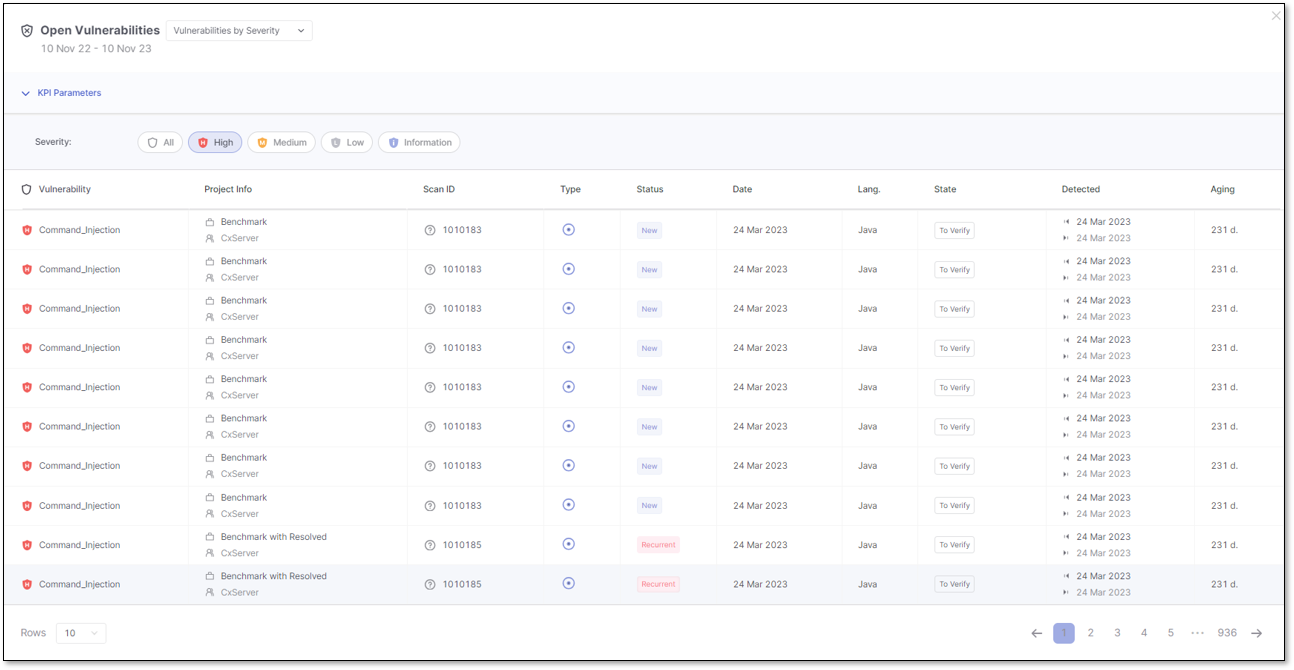
A Show on Table option appears when hovering over a specific severity. Clicking on it opens a new modal window that lists all currently open vulnerabilities for the selected severity. Details such as the first and last detection date, aging, language, and state are displayed for each vulnerability.
Vulnerabilities by Status
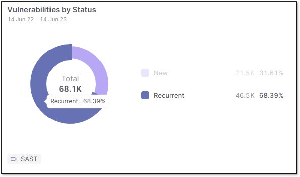
The pie chart below displays the results grouped by status, representing the total findings and their percentage for each status.
Please note that the data used in the calculation is based on the latest scans and open results. Therefore, resolved results are unavailable as part of this KPI and are no longer included in the current findings.
When hovering over a specific status segment on the pie chart, the information for that status is highlighted.
 |
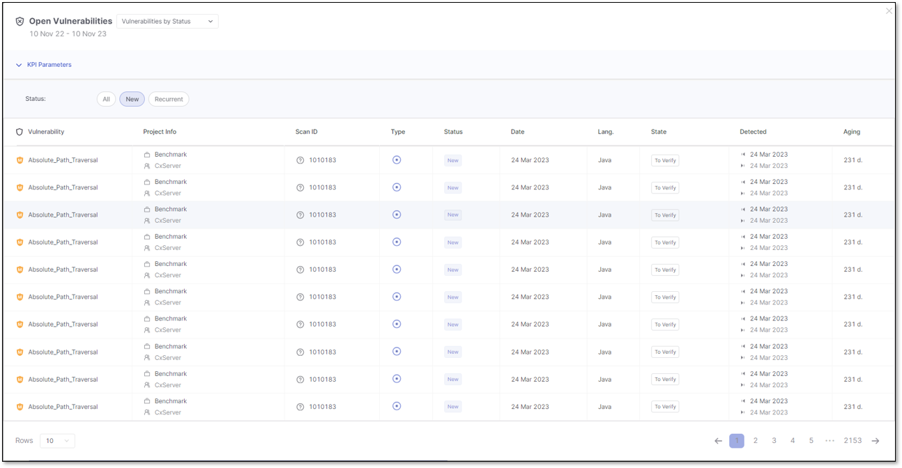
A Show on Table option appears when hovering over a specific status. Clicking on it opens a new modal window that lists all currently open vulnerabilities for the selected status. Details such as the first and last detection date, aging, language, and state are displayed for each vulnerability.
Vulnerabilities by State
The KPI displays the results grouped by State, including custom result states. By hovering over each state, you can view the details for the total number of findings, their percentages, and their density.
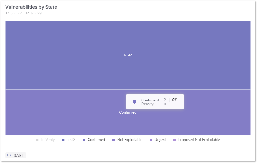 |
Use the State legend to hide or show results for specific states.
For example, in the image above, results for To Verify are hidden, and Not Exploitable, Urgent, and Proposed not Exploitable are selected, even though there are no findings for these states. Only Confirmed and Test2 have findings associated with them.
This interactive visualization tailors your KPI view to focus on specific states and allows you to manage and analyze the results based on different states easily.
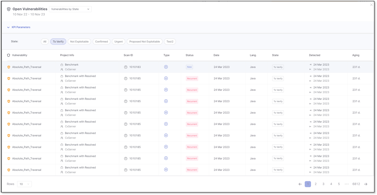
A Show on Table option appears when hovering over a specific state. Clicking on it opens a new modal window that lists all currently open vulnerabilities for the selected state. Details such as the first and last detection date, aging, language, and status are displayed for each vulnerability.
Vulnerabilities by Severity and State
Below is the table showing the total number of results grouped by result state, including custom result states. Each state is further organized by severity.
The table provides a comprehensive overview of the distribution of vulnerabilities based on their result states and severity levels, enabling effective analysis and monitoring of security-related outcomes.
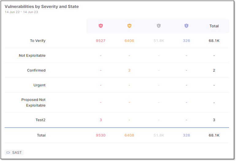 |
Hover over the total results for a specific state and severity to highlight the value and click to reveal more information, like a list of all currently open vulnerabilities for the selected state and severity. Each vulnerability detail includes the first and last detection date, aging, language, and status.

Top 20 Oldest Vulnerabilities
This card presents the 20 oldest vulnerabilities of all projects, regardless of language. For each vulnerability, you can view its age, measured in days.
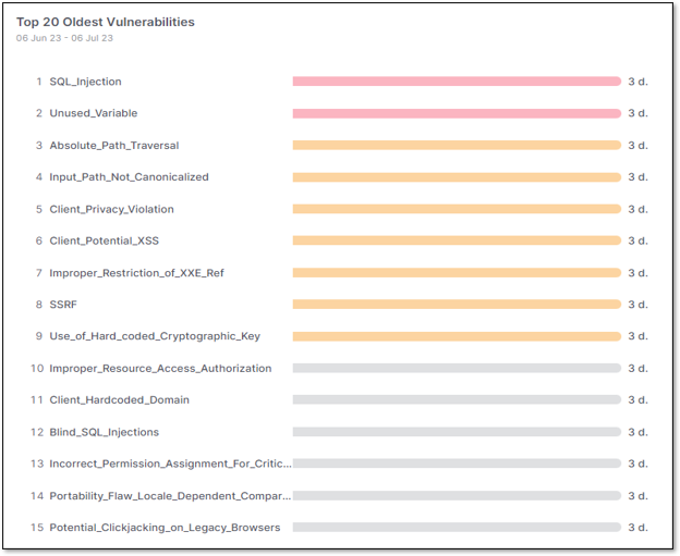 |
For more details about the KPI calculation, please see Vulnerability Aging .
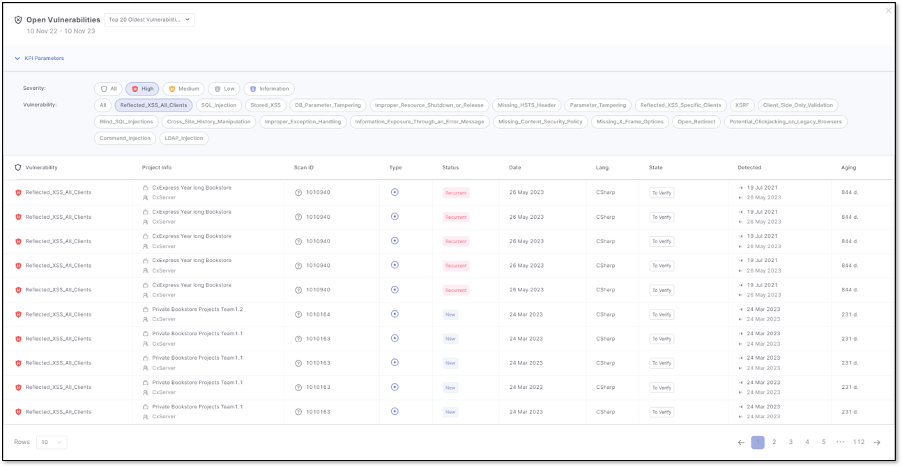
A Show on Table option appears when hovering over a specific vulnerability. Clicking on it opens a new modal window that lists all currently open vulnerabilities for the selected vulnerability. Details such as the first and last detection date, aging, language, and status are displayed for each vulnerability.
Top 20 Vulnerabilities
This card presents the 20 riskiest vulnerabilities found in scans, ordered by severity, from high to informational, regardless of the language.
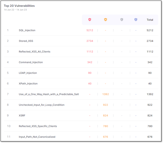 |
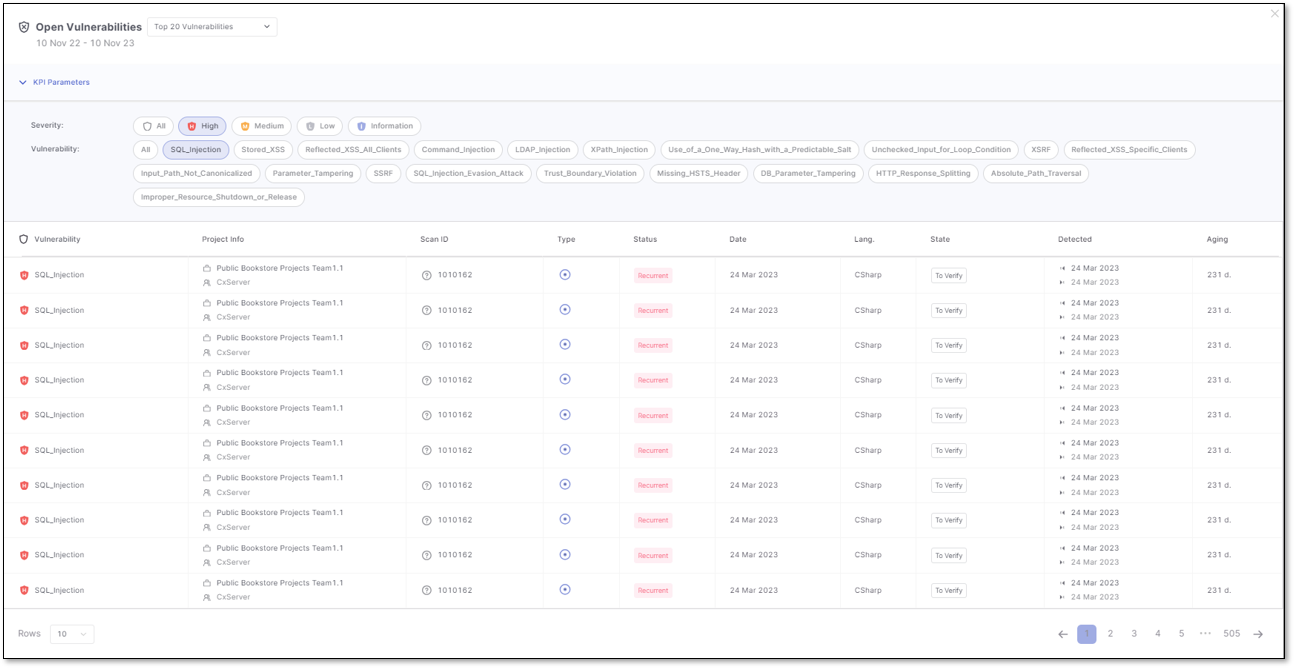
Hover over the total results for a specific vulnerability to highlight the value and click to reveal more information, like all currently open results of the selected vulnerability. Each vulnerability detail includes the first and last detection date, aging, language, and status.
Managing Filters
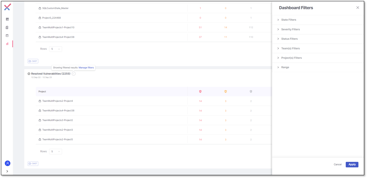
Every card provides information about the specified time range used as a filter to get the results to display. You can customize these filters by clicking  , which opens the filter panel, enabling you to fine-tune your search criteria.
 |
For further details regarding filters, please see Filtering KPI.